Objective: To restructure Skin401’s existing content strength with a trustworthy visual identity and clear strategic tone. The goal was to merge two key qualities: the feeling of scientific credibility and the “confident simplicity” that resonates with modern young women.
Target Brand Type: A new-generation dermocosmetic
Tools & Process:
Research: moodboarding, competitive landscape, user persona sketching
Strategy: Positioning map, tone of voice framework, packaging shelf analysis
🤍What I See in Skin401
Skin401 stands out with strong formulations and a purposeful dermocosmetic vision. Its ability to speak to a younger audience while maintaining clinical credibility is a rare balance — and a strong foundation to build on. This rebranding exploration aims to highlight, not change, what already makes Skin401 unique — by giving it a sharper visual and tonal consistency.
📌 Growth Opportunities – Where We Can Strengthen Together:
🎯 Goal: To translate Skin401’s existing credibility into a more cohesive, recognizable identity — one that builds emotional connection without losing trust.
Research & Strategic Positioning
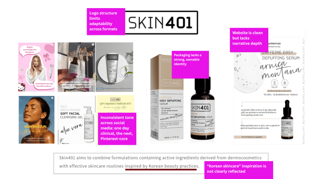
Competitive Landscape * Rhode – visually aspirational but not skincare-focused * The Ordinary – science-backed, but emotionally distant * Glossier – friendly & cool, but lacks clinical trust * La Roche Posay – trustworthy, but not youthful or Instagram-native Skin401’s opportunity: A balance between Rhode’s aesthetic, Ordinary’s credibility, and Glossier’s tone — delivered with clarity and care. Positioning Statement: “A next-gen eye care brand that blends dermatological science with visual serenity and emotional connection.” Brand Voice Decision Too clinical → feels cold Too playful → loses authority I chose: “Warm science.” Like a trusted dermatologist who also understands lifestyle.
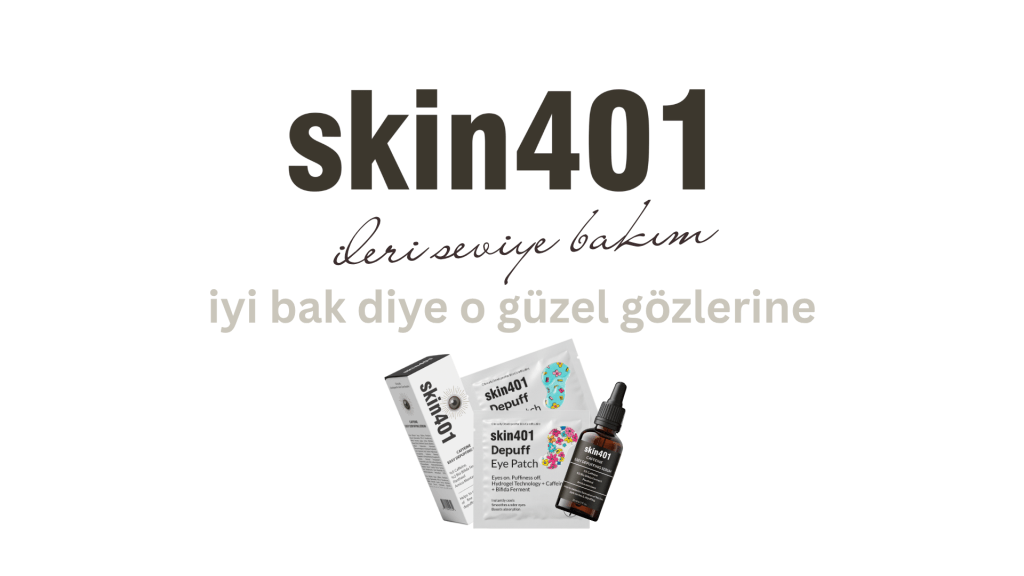
LOGO: Old logo structure limits adaptability across formats. I designed a new logo system and refreshed the visual DNA with a calming color palette and a rational, confident font structure. Psychology in Design: White → cleanliness & clarity Skin-toned nudes, brown → warmth, intimacy Brand Keywords: Pure – Clear – Scientific – Rested Design isn’t decoration. Each decision aligns with the brand’s emotional and psychological promise.
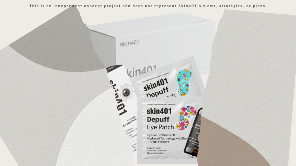
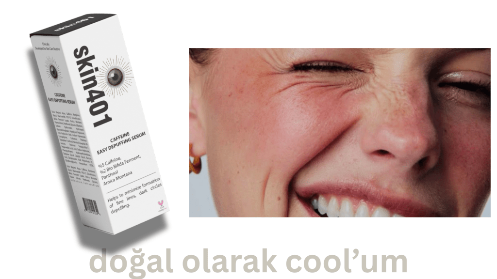
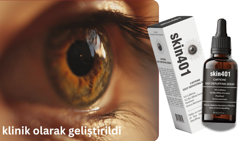
PACKAGE: Imagine a woman scanning crowded beauty shelves. She doesn’t want glitter or buzzwords. She wants to feel understood. Our design doesn’t scream. It quietly says: “This is for you.” I developed a structural packaging system that’s clean, tactile and premium. Bottle, box and label were all designed for clarity, consistency, and shelf impact. Your product has one second to stand out on shelf. The old design lacked stopping power. My version wins attention by being the most silent one in the room.
Functional strategy:
– Matte glass bottle protects formula
– Dropper for controlled usage
– Label stripped down to essentials
Shelf Impact: In a sea of overly saturated skincare, we chose quiet confidence. This design feels like a breath of fresh air — and it earns trust.
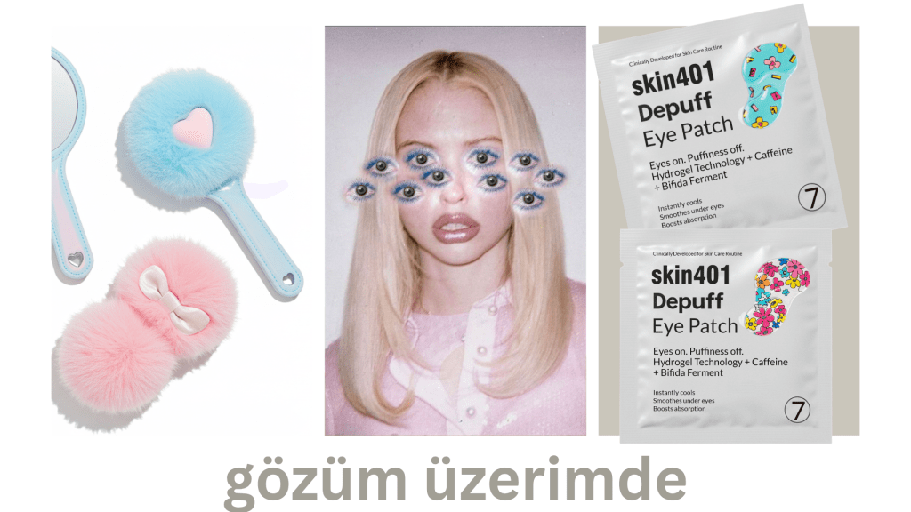
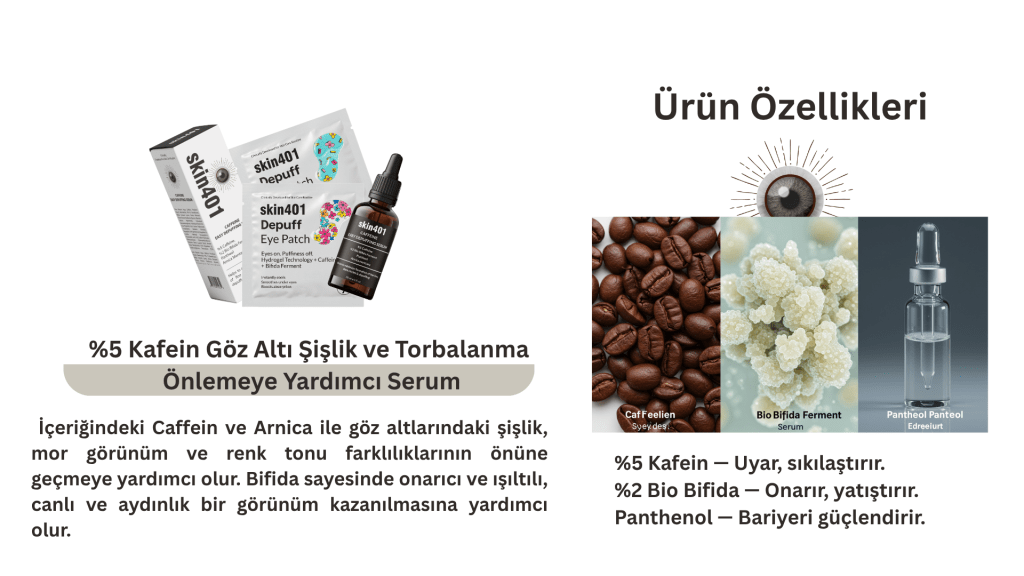
Eye Patch Design: I introduced a complementary product: under-eye patches that visually and functionally extend the serum experience. This isn’t just aesthetic. It’s business strategy. The eye patch supports the story of rest and restoration. I don’t just design for now. I design to grow product lines that feel cohesive and compelling.
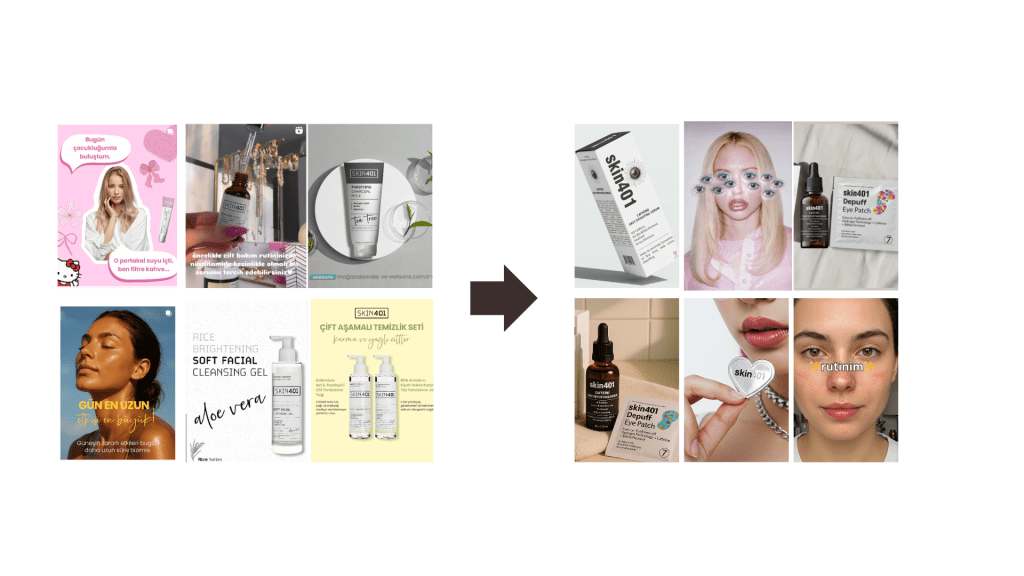
Social Media Strategy: Visual & Verbal I curated a feed style, story icons, brand voice, and post types that reflect a refined, modern dermo-cosmetic identity. Clear, informative, not clinical. I explain science — without losing warmth. Grid balance (product, lifestyle, texture) Highlights = clean, muted icons CTA placement + link strategy Saveable content: “3 signs your under eyes are tired” etc. When someone visits the feed, they feel this: “This brand understands skin — and understands me.”
Website Copy : Focused on outcomes, not just ingredients – Structured for skimming (bullets, bolding) – SEO-optimized for under-eye fatigue queries. Great copy doesn’t just describe. It converts. It earns trust. It keeps people reading — and buying. We don’t say “It has caffeine.” We say: “You’ll look like you slept 8 hours — even if you didn’t.”
Outcomes • A more defined and ownable brand voice • Increased visibility without losing integrity • Three words that now define the brand: Scientific – Clean – Honest • A potential customer feels: “This is for me. I can trust this.” I didn’t just design.
This is a creative case study.
This is an independent concept project and does not represent Skin401’s views, strategies, or plans.
If this approach inspired you too — let’s connect.